NEXUS Banking App
A next-generation payment and banking app designed for speed, security, and seamless UX — featuring card management, real-time analytics, Add Money flows, and an intelligent Help Centre, all in a polished dark interface.
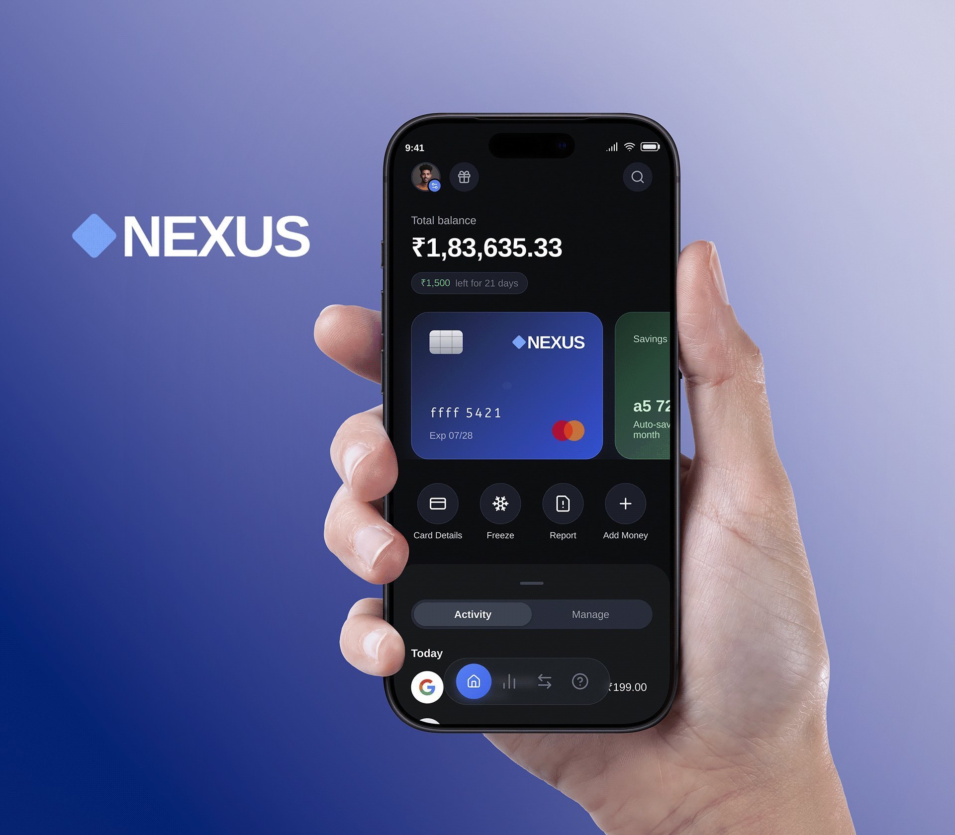
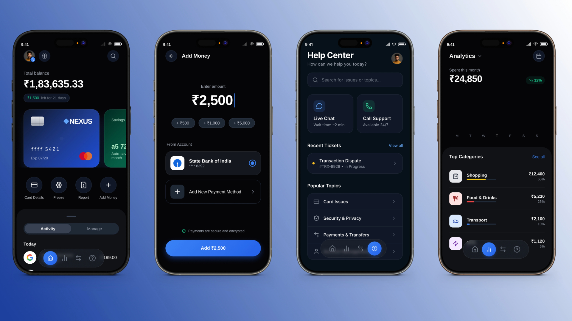
Most Indian banking apps overwhelm users with dense information and poor hierarchy. NEXUS is designed for someone who checks their balance, sends money, and reads spending data — not for someone with a banking degree. The core problem: clarity under complexity.
A 25–40 year old urban professional using their phone to manage all finances. They book train tickets, pay rent via UPI, and check their card statement monthly. They get frustrated when finding the 'freeze card' option requires three taps through buried menus.
The home screen shows only what matters: total balance, recent transaction, and a card thumbnail. The four quick-action buttons (Card Details, Freeze, Report, Add Money) are always one tap away. I kept the bottom nav to 4 icons — any more creates cognitive noise.
NEXUS users often check their finances late at night or during a commute in dim light. The deep navy background reduces eye strain while making the blue card UI feel premium. Colour is used functionally — green for incoming, red for outgoing — not decoratively.