Payit. Payment App
A clean, intuitive UPI payment app designed for the Indian market — featuring frictionless peer-to-peer transfers, transaction history, security settings, in-app support, and a polished light-mode interface.
UPI apps in India work well for technically confident users but fail the 35+ user who just wants to pay a relative. Payit focuses on the core three actions — Send, Request, Scan — and makes everything else secondary. The problem is UX clutter masking a simple task.
Two personas: a college student splitting chai money, and a shop owner accepting daily payments. Both need speed and trust. The student uses peer-transfer daily; the shopkeeper uses the QR scan. Both need the transaction to complete without confusion or anxiety.
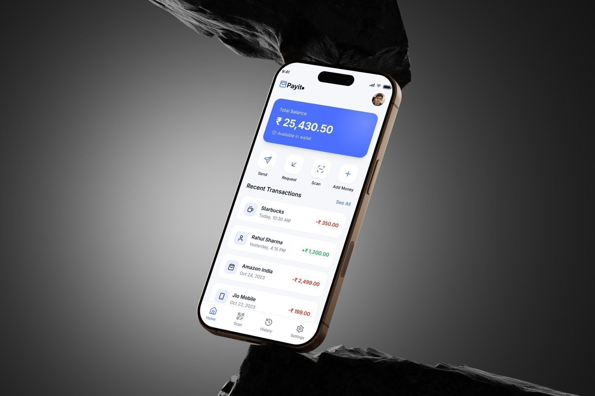
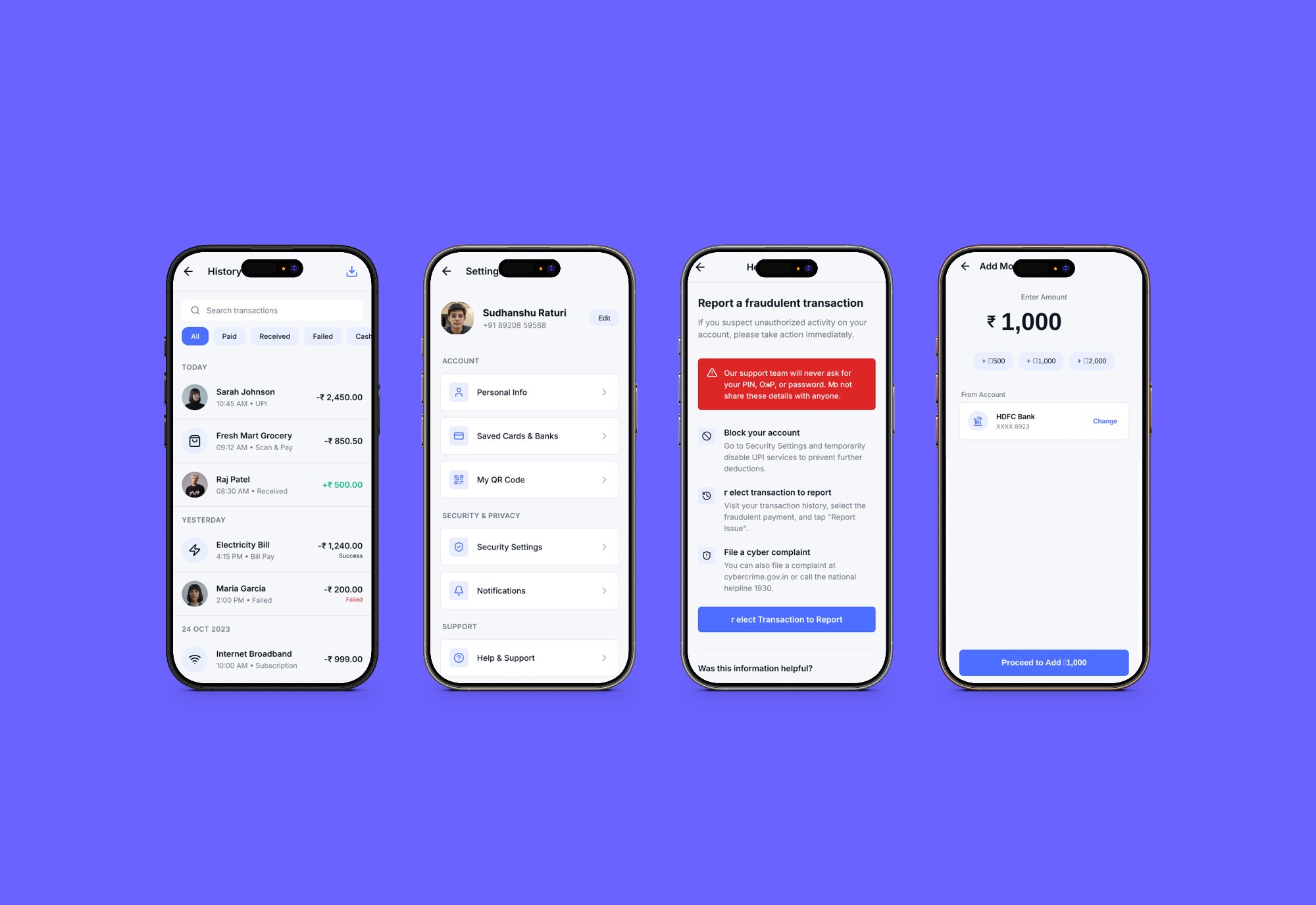
The home screen shows total balance prominently, then four action buttons in a 2x2 grid (Send, Request, Scan, Add Money), then recent transactions. Nothing else. Transaction history uses a three-tab filter (All, Paid, Received) with colour-coded amounts. The 'Report Fraud' flow uses a red alert banner with plain language steps — no legal jargon.
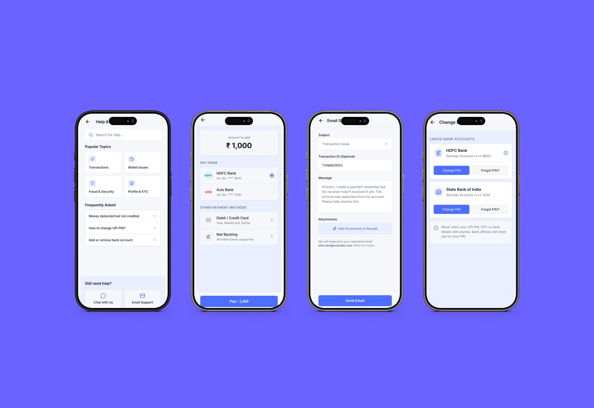
Payment apps live or die on trust. Every screen communicates security: the 'Payments are secure and encrypted' label on the add-money screen, the red warning banner on the fraud screen, and the bank logo next to the account number during payment selection. These are not decorative — they reduce abandonment at the payment step.